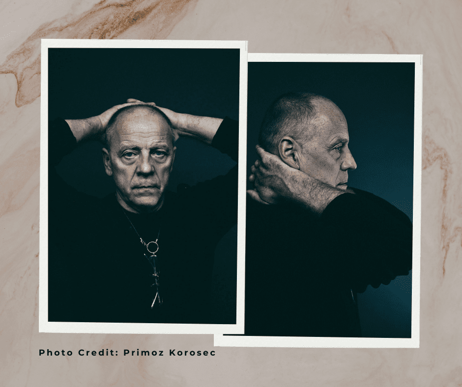
Interview with Mirko Ilić
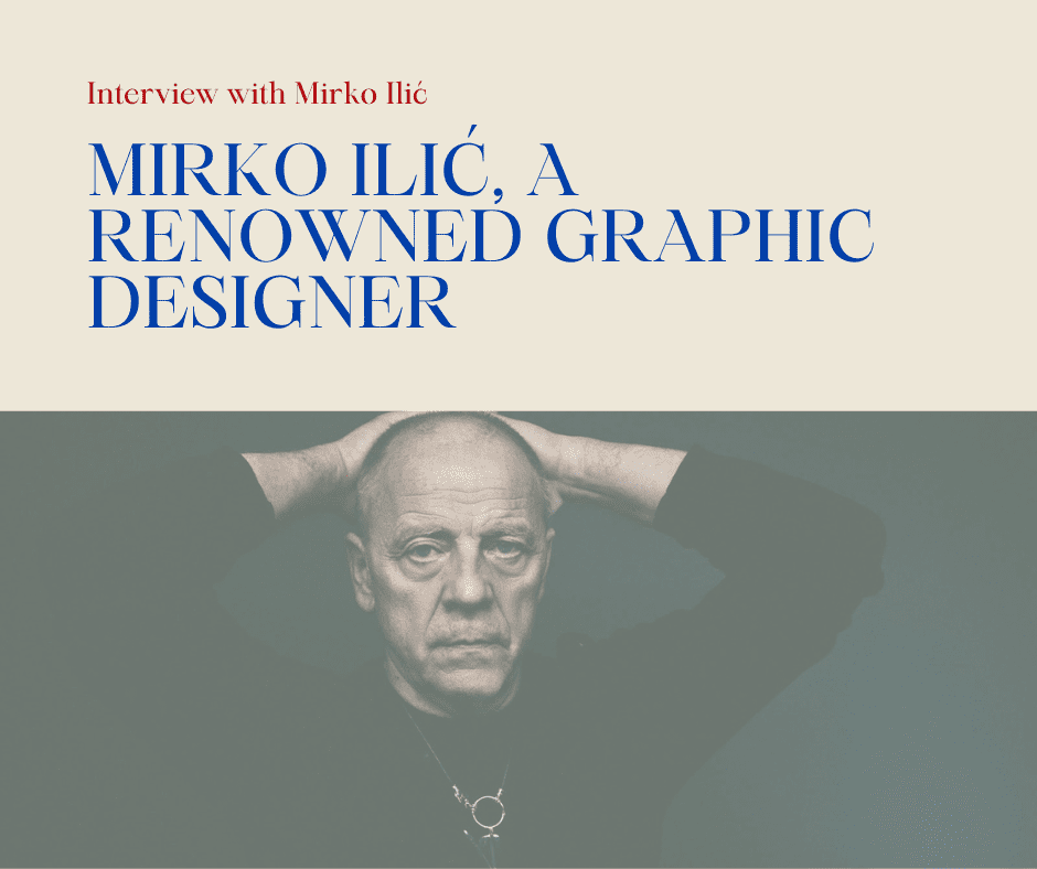
Mirko Ilić, a renowned graphic designer
Mirko Ilić, a renowned graphic designer originally from Yugoslavia, is a distinguished professor of design and an artist whose collection of works is part of the MOMA museum in New York.
He has been living and working in New York for 30 years. His Mirko Ilić Corp. is a well-known multi-disciplinary design studio in New York specializing in graphic design and illustration.
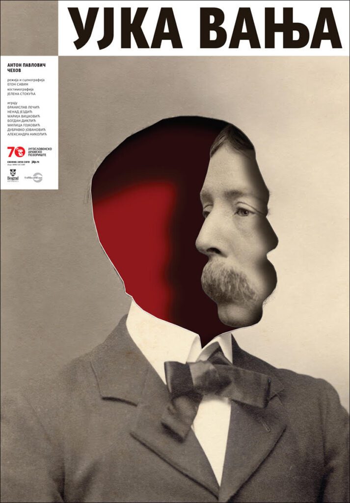
In the last six years, Ilić has been collaborating with the Yugoslav Drama Theater from Belgrade. For years, Mirko Ilić has received awards and recognition for the posters he creates for the performances of the Yugoslav Drama Theater in Belgrade. One of them is the award of the prestigious American magazine Grafis, which they have received so far for the plays “Kaspar,” “Fuck it.. Who started again”, “Belgrade Trilogy,” “Open Sea,” “Lorencacho,” “Uncle Vanja,” “Natan the Wise” and ” The Glass neck.”
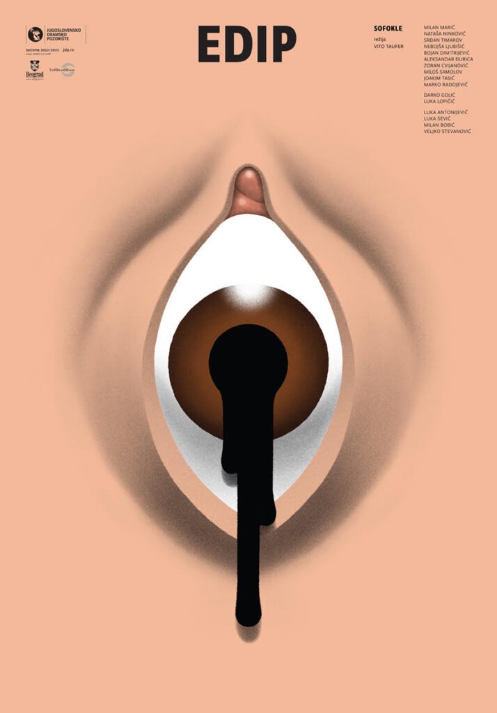
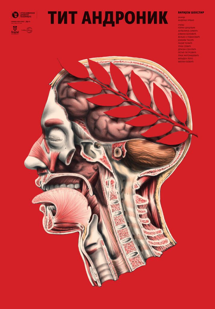
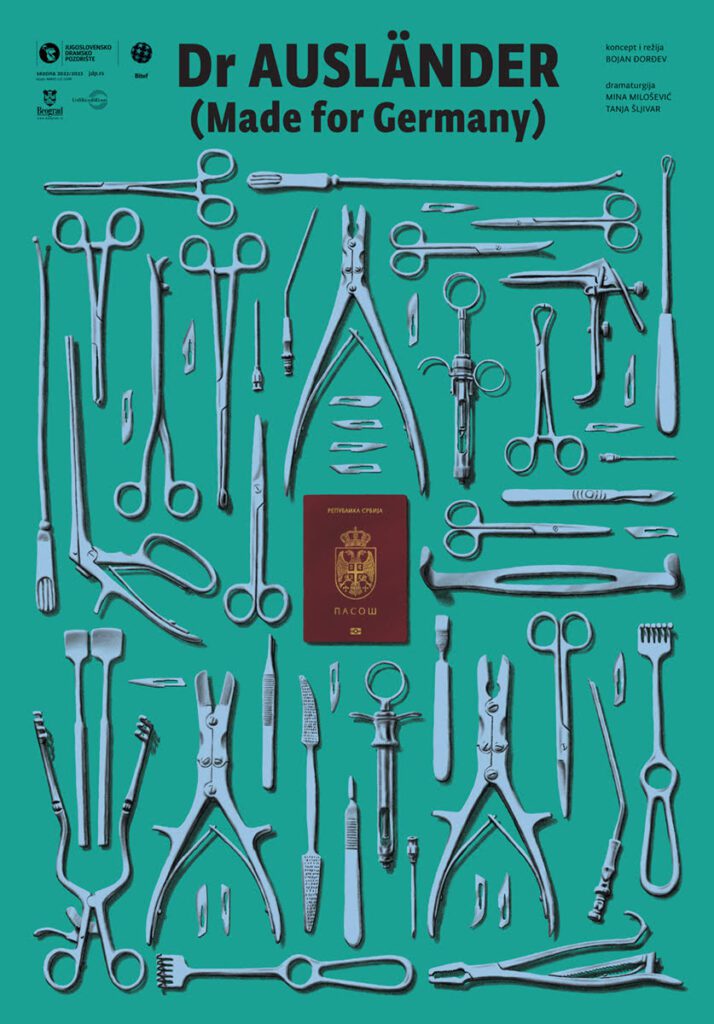
This year the poster for the play “Oedipus” (Greek tragedy by Sophocles) was awarded the “Platinum Award. “Silver Awards” went to the posters for the plays “Dr. Auslender” and “Titus Andronicus,” by far William Shakespeare’s bloodiest tale. The poster for the play “Miracle in Šargan” received “Special recognition.” All the posters will be published in the Grafis yearbook.
In the exclusive interview for Yu Biblioteka, Mirko Ilić talks about his work and awards. He reveals his work process, explains what is the most important for one creative person, and talks about a big and significant project – Tolerance. This exhibition has gathered 171 artworks and has been presented in 46 countries so far.
How did you start cooperation with the Yugoslav Drama Theatre?
In 2017, Gorcin Stojanovic from JDP contacted me and asked if I would like to redesign a season of posters.
What does the process of working on posters look like? What is important to you to communicate visually?
My only condition for working on poster design was making the final version of the poster; if the theater likes it, that’s it.
If not, they will have to find someone else to design for them.
That might sound a bit arrogant to you, but it’s not.
First, I have been making posters for the theater for forty years.
Second, the fact that I give them one and the final version does not mean that I give them anything, and they have to accept that.
Apart from many years of experience, I invest in design a lot of thinking and effort.
The last thing that comes to my mind is that after all that work, someone, thinking that the poster is a stage, starts to direct it.
Meaning they move elements around the poster, replace them, enlarge and/or reduce them.
Look, I agree to that occasionally when I work for theaters in the US.
Here, the design decision-making system is much more complicated.
But that’s why they pay me twenty times more for poster design.
It’s a compromise.
So I can afford to design posters for someone else, but how I want.
It’s always a matter of balance.
Where do you start when you are making a poster for a play?
Of course, from the text of the play.
I always ask JDP to ask the director to write me a dozen sentences about their vision and concept of the play.
Additionally, it is essential, especially if it is a well-known play, to know what the previous posters for that play looked like.
Partly so that no repetition happens by chance and partly to see if some of the ideas on those posters can be moved a step forward.
How do you manage to simplify complex plays to reduce them to a striking and recognizable symbol?
Not only am I a visual artist, but I am also a designer.
One part of that profession is information.
The poster, as an information device, must have two levels of information.
The poster must convey the first level of visual information in 4/5 seconds.
That’s how long it usually takes a person to pass by him.
If that level of information is successful, the person will pause and perhaps see and read another piece of information.
Which plays were the most challenging for you? Did you spend more time working on some posters, exploring the possible visual identity of the play?
Probably the first show of the season.
Namely, to complicate my life more than necessary, I decided to create a slightly different branding for each season (different than it was in the last season).
More or less, only the typeface/font remains the same; everything else changes.
I partly decided to avoid “fatigue of the material.”
I wanted to avoid making my poster style dull.
But also, if I put myself in a design template, I will be bored doing them.
And if I’m bored doing them, the audience will probably be bored watching them too.
And again, to avoid total visual anarchy, I decided that every theatre season looks similar.
That’s why the first poster of the season is the most complicated for me.
First, I usually find out a month in advance which play it is, but then I still don’t know which show will be next.
Therefore, all the decisions I make on the first poster of the season must apply to the other posters of that season.
Due to Covid, the third and fifth seasons of JDP had a reduced number of plays/posters.
What is the significance of the Graphis awards (awards from a prestigious American magazine Graphis) you received for the posters you created for Yugoslav Drama Theater?
Of course, like any other vain creative person, I am glad to receive an award.
When a creative person makes something good, they know it deep down.
And that is the real and most important reward.
However, that person always hopes that others will notice and reward him in one way or another.
Of course, that same creative person also knows when he does something very bad.
Then, he hopes that others will not notice.
For me, the best thing that happened this year with the Graphis magazine awards is that I won them for theater posters for JDP, but also for theater posters for Lincoln Center Theater.
These are the ones that аre paid twenty times more.
Pure proof that the quality of creativity has little to do with money.
Will you be doing posters in JDP in the next season as well?
I think so, although I have not yet received the name and text for the first play.
I would also like to ask you a question about the Tolerance project, which has been held in 48 countries so far, and was recently held again in Serbia. How did the idea for that project come about? How was it presented so far? What is the future of the project?
My company, if you can call it so because it’s just the two of us, does an average of 60% of projects for free.
Of course, these projects are dear to us, important, and close to our hearts.
These are not commercial projects.
So in 2016 and 2017, I did the visual identity for the House of Tolerance film festival in Ljubljana for free.
In fact, I helped them find funds for the festival.
As a sign of gratitude, during the 2017 festival, they offered me a small square and pedestal to display what I wanted.
Of course, they thought I would exhibit some of my works.
Since I did the festival for free, it seemed to me that it would be some kind of payment.
That’s why I decided to invite 23 (there was so much room on the pedestals) famous designers from all over the world to make a poster on the topic of tolerance.
Namely, that was also the theme of the festival.
My only instruction to the designers was that the poster must have the word tolerance prominently written on it.
That the word must be in the language and script of the country they come from.
And they must write their name and the name of the country on the poster.
In less than a month, I received 23 fantastic posters.
The exhibition went very well.
It lasted for a week, as long as the festival.
And that was it.
Then, I thought that It would be unfortunate that those beautiful posters exhibition should end.
In thinking about it, it occurred to me to make a traveling exhibition.
To invite a famous designer from that area to make a poster in each new place/country.
So I have the language and theme of that environment on the poster.
Now, five and a half years later, we have had 171 exhibitions in 46 countries.
And in the collection, which is constantly growing, we have 216 posters.
Finally, I would like to ask you if you are familiar with the design scene in Serbia and in the world. What trends are you noticing?
Trends should be avoided as much as possible because they are transitory.
Otherwise, you may end up constantly running after them.
What would you say to young designers?
If you love what you do, that love will translate into your work, and then others will see and feel it.
Jelena Jovanović
INFO
Mirko Ilić graduated from the School of Applied Arts in Zagreb, published his first works in 1973, and has since been publishing comics and illustrations in magazines, He designed album covers for some of the most prominent Yugoslav bands of the time, covers for the Croatian political weekly magazine Danas, as well as posters for theaters and movies. In 1977, Ilić started publishing his works in established comics magazines outside of Yugoslavia
In March 1986, he moved to New York. He started publishing his illustrations in Time, The New York Times, The Wall Street Journal, and many other prominent and influential newspapers and magazines. In 1991, he became an art director of Time International, and the following year he became the art director of the op-ed in The New York Times.
In 1995 he founded Mirko Ilić Corp., a graphic design and 3-D computer graphics and motion picture title studio. In 1998, he created the title sequence for the romantic comedy You’ve Got Mail with Milton Glaser and Walter Bernard.
In 1999, Mirko Ilić Corp. began designing visual identities for luxury hotels and restaurants. Some of his hotel clients include The Time Hotel in New York City, The Joule Hotel in Dallas, TX, Casa Moderna Hotel in Miami, FL, and Alpina Gstaad in Switzerland. Some restaurant clients include Le Cirque and La Fonda Del Sol in New York City, “Summit” and “Play” at The Broadmoor Hotel in Colorado Springs, Charlie Palmer in Dallas, TX, and “The Seafood Bar,” “Echo,” “Flagler Steakhouse,” and “HMF” at The Breakers (hotel) in Palm Beach Florida.
Since 1999, Ilić has been a professor at the School of Visual Arts for their MFA in Illustration program.
In 2012, Print published his monograph by Dejan Kršić with a preface by Milton Glaser and an introduction by Steven Heller.
In 2015, 38 pieces of his artwork were included in the collection of the Museum of Modern Art (MoMA). MoMA acquired artwork, including posters, LP designs from his Yugoslavian period, and his designs of The New York Times OP-ED pages. In September 2015, four of his pieces were exhibited for the first time in MoMA’s exhibition Making Music Modern.
His work is also in the collections of the Smithsonian Institution, the San Francisco Museum of Modern Art, and many other institutions and museums.
His original illustrations for the covers of Time Magazine, among other pieces, are a part of the Smithsonian National Portrait Gallery in Washington D.C.
Since 2017, Ilić is the creator and organizer of the Tolerance Traveling Poster Show. This international exhibition brings together leading designers from around the world to create posters on the topic of Tolerance. Past participating designers have included Milton Glaser, Paula Scher, Ralph Steadman, David Hillman, and Gunter Rambow, among others. In 2019 he established the Tolerance Project Inc., a non for profit organization.